magazine research
Fashion magazines
:max_bytes(150000):strip_icc()/Kim-Kardashian-Elle-Magazine-56a631133df78cf7728bc3d2.jpg)
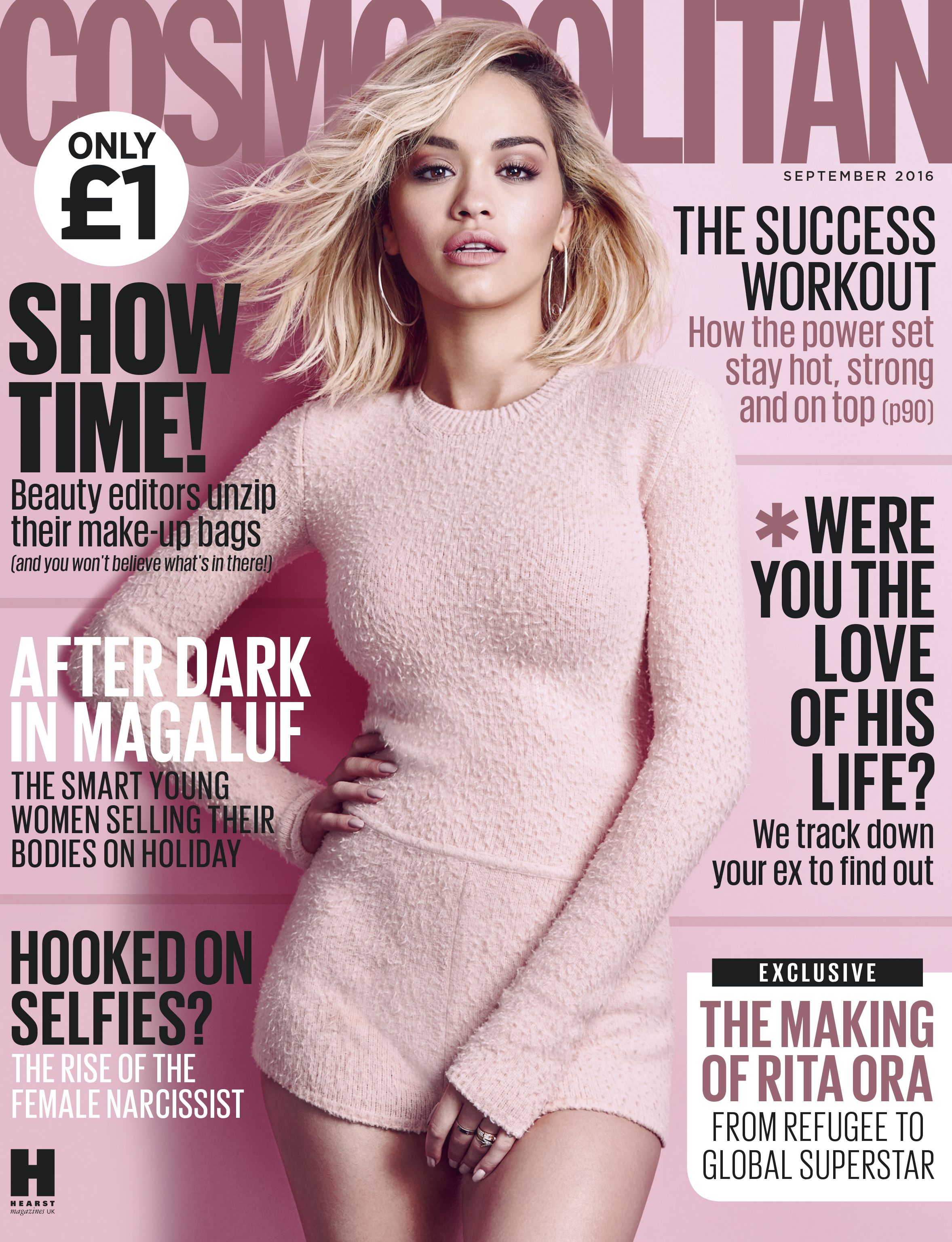
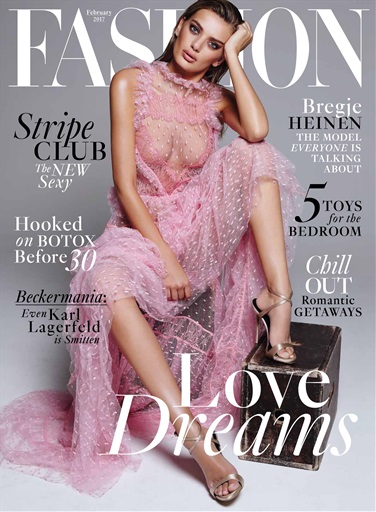
The Typical female fashion magazine has a solid colour background which allows for the subheadings to be seen clearly as they stand out. This type of background also makes the magazine look more professional and can be used to create a colour theme along with the text and image. The colour theme makes the magazine cover more appealing to the target audience and will therefore encourage them to buy it. The colour pink is often used along with other neutral colours so that the pink stands out. Pink is used as it is associated with femininity and suits the target audience. It is also a bright colour that is eye-catching. Elle magazine is different as it uses a bright pink that stands out more than the baby pink used on the cosmopolitan and the fashion magazine. This creates connotations of power along with femininity and therefore challenges the stereotype of women being weak. This is used because the typical target audience is women. Kim Kardashian is also pictured looking powerful as she has a serious facial expression and is standing in a way that makes her look confident. Along with the picture 'Confidence' is written in big and bold text in a bright pink colour which is empowering women and giving a message that all women should be confident and this appeals to the target audience. All of the magazines have the brand name at the top of the page which is bigger than any other text on the page which makes the magazine easy to identify. The model is placed in the middle of the page which makes her the centre of attention and is often the first thing the audience will look at and this is why it is important to do a photoshoot so that the best photo can be chosen. The subheadings are placed around the model in a variety of different sizes, colours and fonts to make each one stand out and so it is easier for the reader to identify the different subheadings.
From my research I now Know some of the elements that I will include in my magazine cover. For example I will include the colour pink along with other neutral colours such as grey and white so that the pink stands out. Once I have come up with the brand name of the magazine a font will need to be chosen that is unique to the magazine. This will be placed at the top of the page in a bold, large font. The subheadings will be in different fonts and smaller than the brand name but will still vary in sizes depending on which subheadings I want to stand out more than the others. The colours of the subheading will also be different so that it is easier to identify the separate headings.
Comments
Post a Comment